Elucidating Machine Learning models with SHAP values
The problem
During data analysis, we may only look at metrics such as accuracy/precision/recall and worry about not overfitting our data. But are those the only ones that matter?
When it comes to real world scenarios, when we need not only to provide a model with a good prediction rate, but as well the explanations behind the decisions taken by our model, it is quite a difficult task:
- if we go with simpler and easier to explain models, we leave some performance on the table;
- if we just aim for performance, we go for highly complex models, but at the cost of the explainability.
Sounds quite a tricky tradeoff, doesn’t it? We also need to keep in mind, that sometimes the explainability of our decision-making process need to be clear, such as the ones proposed in the GDPR (right of explanation section).
A possible solution
But, if we can still adopt complex models while keeping the explainability factor? For this we can rely on a technique called SHAPley values, which is heavily based on the Game Theory.
In a short explanation, we can describe the SHAPley values as a measurement of the importance of each feature into our models final prediction. This definition, of course, is a really reduced one, so if you are interested in a more detailed one, there are two great resources to look for [1] [2] .
A hands-on example
At BraSCCH (Brazilian Smart Care for Child Health), we most of the time deal with training Machine Learning models that can help us on the task of identifying neonatal death.
For this task, we use a dataset that contains several features related to a given newborn, such as: mother’s age, the newborn weight, vital signs (such as breathing, muscular tonus, appearance, etc). What if we wanted to know, even when using a complex model, such as a Extreme Gradient Boosting, or a Neural Network, which are the features that play a major role in the prediction result?
For this task, we will be used the concept of SHAPley values, implemented on the SHAP library, which is primarily developed in Python and can be installed directly from pip (pip install shap and that’s all).
Displaying a summary plot
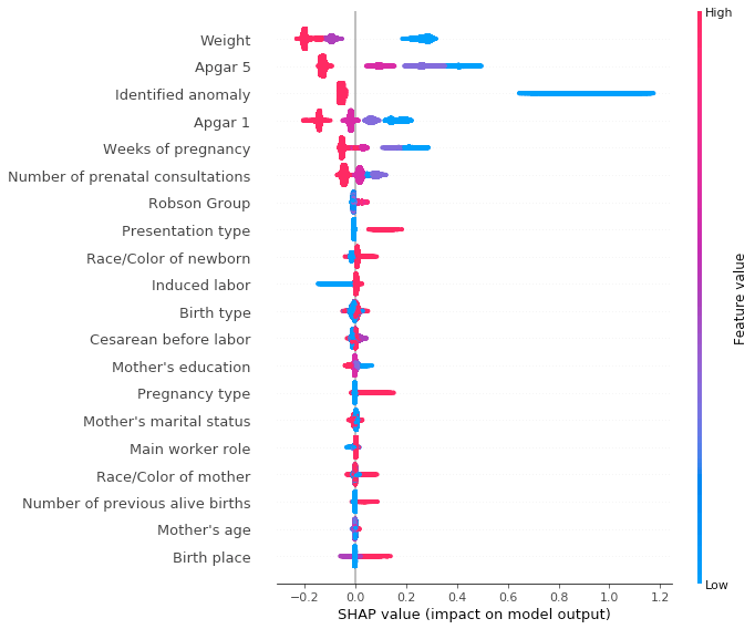
In order to have a clear vision of the features and their impact on our model, we can use a summary plot, which sorts the features by their SHAP values, representing their influence on the model output.
By displaying our summary plot, we can see that the features that play a major role in the model decision are:
- Newborn weight
- APGAR 5 (vital signs of the newborn at the 5th minute of life), if there was any identified anomaly
- APGAR 1 (similar to APGAR 5, but at the 1st minute)
- Weeks of pregnancy and number of prenatal consultations.
Just an example to explain one of the listed features, we can observe that for the feature weight, as it goes higher in value, smaller is the SHAP value for it, thus indicating that newborns with a large weight have a smaller impact on the classifier output, while that newborns with a lower weight do contribute largely to an increased SHAP value and consequently to the model final prediction.
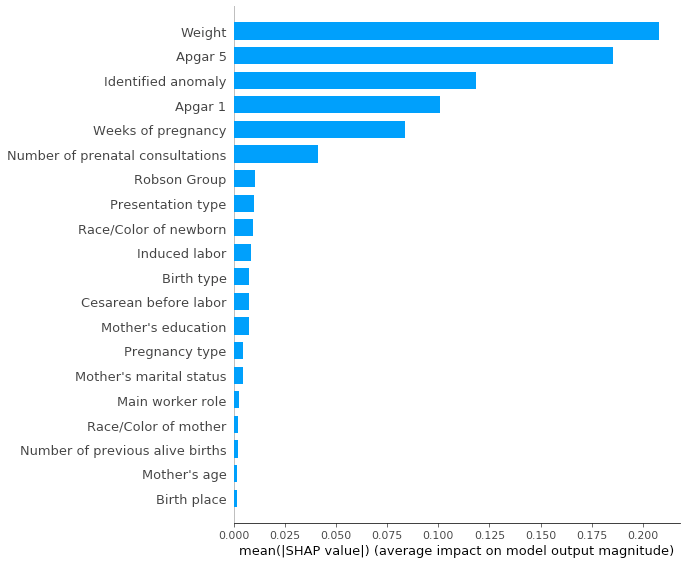
We can also see this same summary plot in a more simplistic manner, by specifying the plot_type parameter as bar.
This plot conveys pretty much a simpler explanation about our model, just displaying the features and their averaged impacts.
The dependence plot
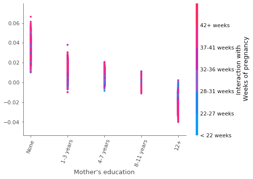
Another highly used plot when trying to understand the correlation between the features and the model outcomes is the dependence plot. This plot allows us to see how a given feature impacts the SHAP value along with the distribution of another feature (commonly referred as interaction feature).
In this plot, we display the mother’s education in years (x axis), correlated with the respective SHAP values (y axis) and the interaction with the feature “weeks of pregnancy” (color bar at right).
We can clearly notice that, the higher the education of the mother, less likely it is for the newborn to die. This may likely happen due to socio-economical factors, since more educated mothers are more likely to have a higher income and thus better living conditions.
Related to this, we can see how the weeks of pregnancy is distributed over the given education category groups. We can notice that for mothers with a high education, the major factor of dying is most likely to be related to a low number of weeks of pregnancy, while that this pattern is not displayed for the other groups.
Conclusions
In this post, we briefly went through one of the tools used to explain Machine Learning models, but there are several others, such as Lime and Interpret. I recommend everyone to play a little bit with those, to have a better grasp of how these tools can better help us to understand not only about our model outcomes, but also about our given problem.


